VIDEO GAME CONCEPT
DESCRIPTION: This project was my college senior project, and I decided to develop concept art, mockups, and some advertising for a potential video game.
PROCESS: This more so than most of my other projects had a heavy amount of research involved. I had initially wanted to make a fully playable demo, so for a few months leading up to the start of the project I researched game development techniques, taught myself the very basics of C#, and practiced using Unity. When the semester actually started, that research shifted from programming to actually figuring out what I wanted the project to specifically be, so that time was spent looking into references and inspiration.
I ended up settling on a mix of art nouveau and body horror, since I thought the mix of clean geometric shapes and messy organic ones would contrast well and make an interesting art style. I didn’t end up sticking with this, but it informed my initial decisions. As for the game itself, I knew I wasn’t very good at programming, so keeping it simple would be best. I looked at a number of indie games that I thought didn’t look too complicated and used them as a benchmark for how complex my game could be, deciding a game with turn-based card combat as its main gameplay feature wouldn’t be too difficult. I didn’t know it at the time, but I was horribly, horribly wrong.
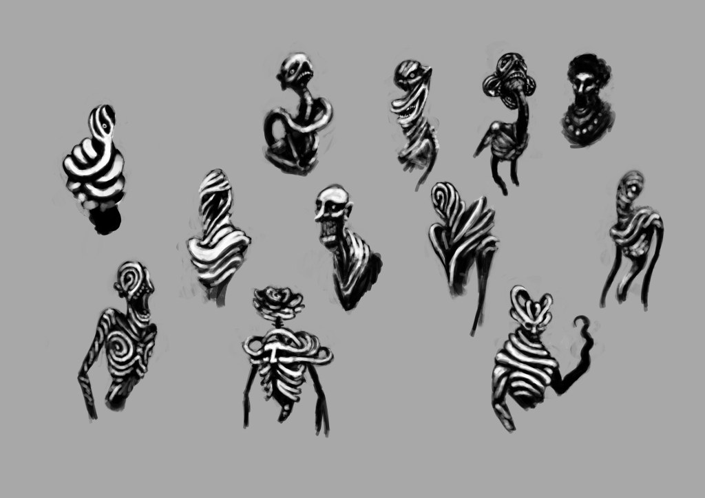
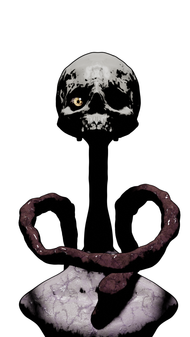
With somewhat of a direction settled, I moved on to character sketches. The wavy sort of organic pattern is something that happened somewhat accidentally while I was doodling, but I liked the way it looked and embraced it. I wasn’t sure about the actual art style at this point, the black and white look was an attempt at a method of blocking out shapes I once saw a professional concept artist talk about, and not something I really intended to keep.


Putting the cart before the horse, I wanted to jump right into 3D, to make a quick mockup and see well the designs would translate, especially since I wasn’t sure whether or not I even wanted to utilize 3D yet. Unfortunately, I had no idea what I was doing, and any model I made that was too detailed would slow my laptop down too far to be reasonable, forcing me to keep the models relatively simple. I’ve since learned better techniques, but to try to salvage the models, I played around with the materials until I ended up on a stark black and white one inspired by the initial sketches, locking me into the visual direction I would follow for the remainder of the project.
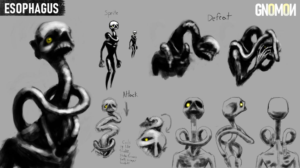
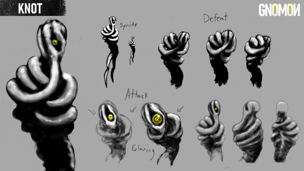
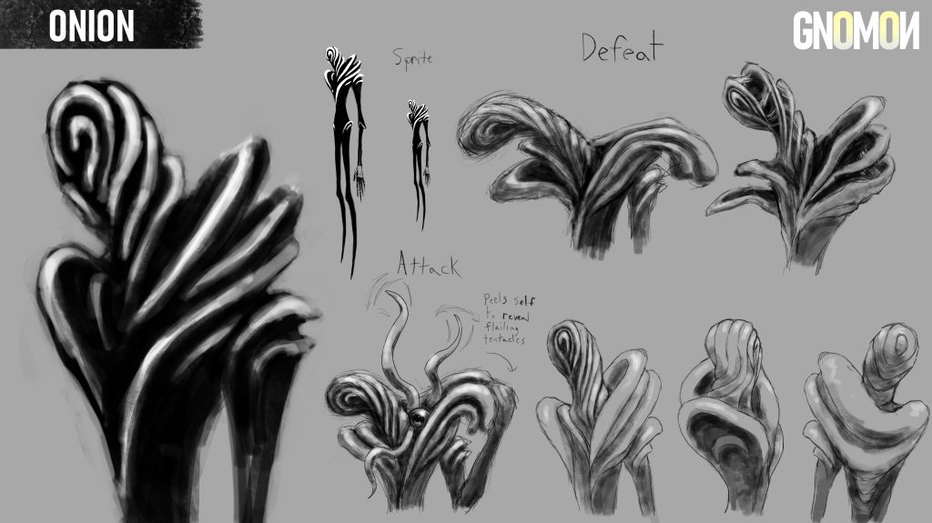
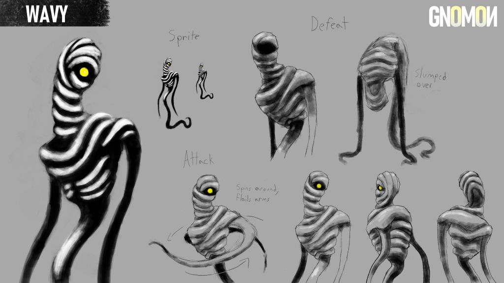
I returned to my original sketches, chose four I was happiest with, and developed a concept sheet for each – making sure to include a pose for a defeat/injury, a pose for an attack, a full body sprite, and a closeup.
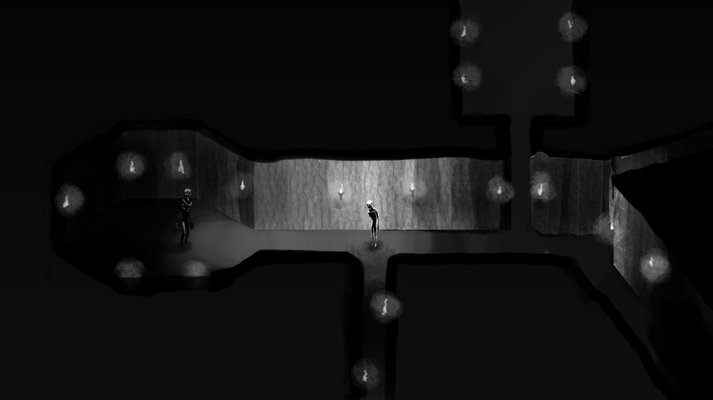


From there it was on to mockups. I focused on the combat screen, trying to get an idea of what the UI would look like, although I also threw together an inventory and overworld screen.
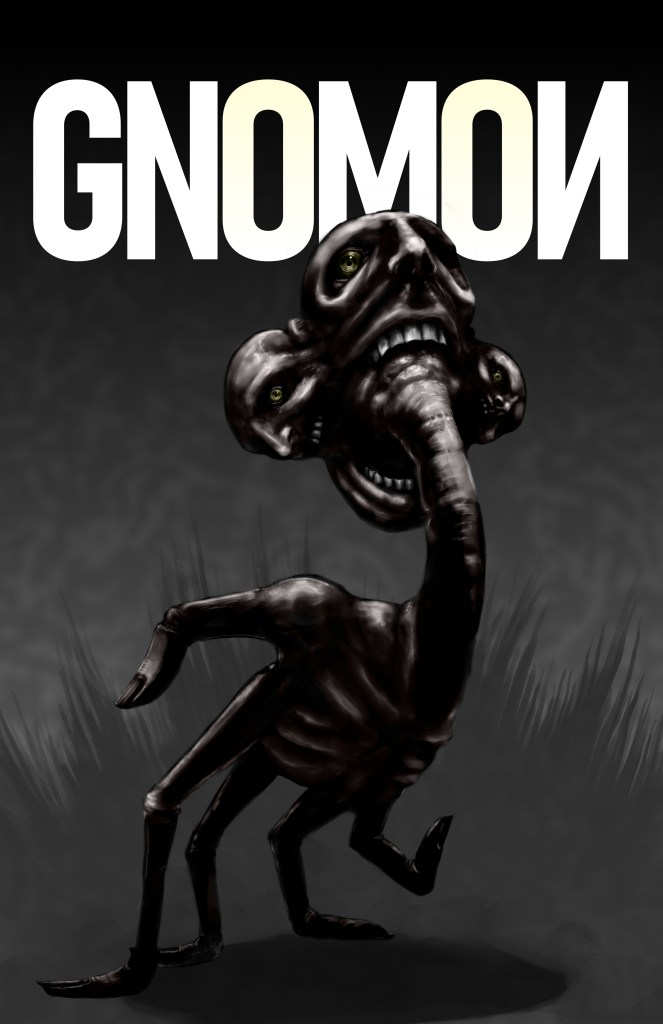
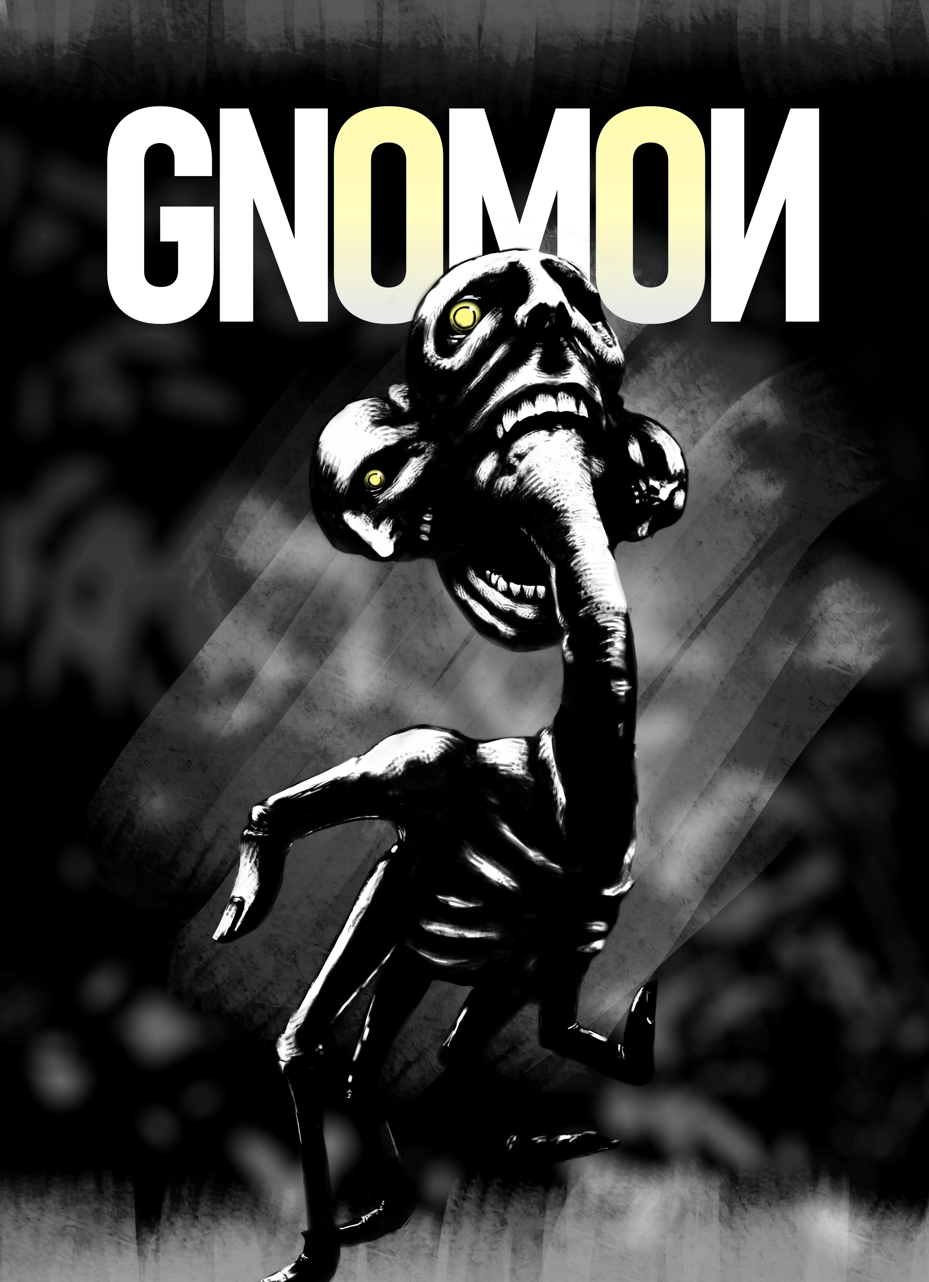
I made a poster based on one of the initial sketches I didn’t pick for the concept sheets, and tried a different more realistic art style. I thought the addition of color would make it more visually appealing and the realism would help emphasize the body horror aspect, but this didn’t end up sticking around.

By this point, I had learned a lot more about 3D modeling, and knew how to make fairly detailed models and materials, so I went back and remade the original models to reflect the art style I used on the cover. This didn’t quite work. The character and charm of the originals were lost, and the new models didn’t work nearly as well in the mockup screens I had made early, so these were discarded, and the cover reworked to look more like the black and white I used on everything else.

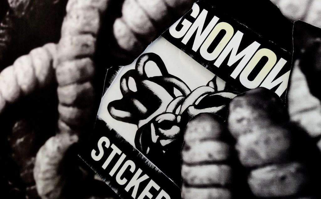
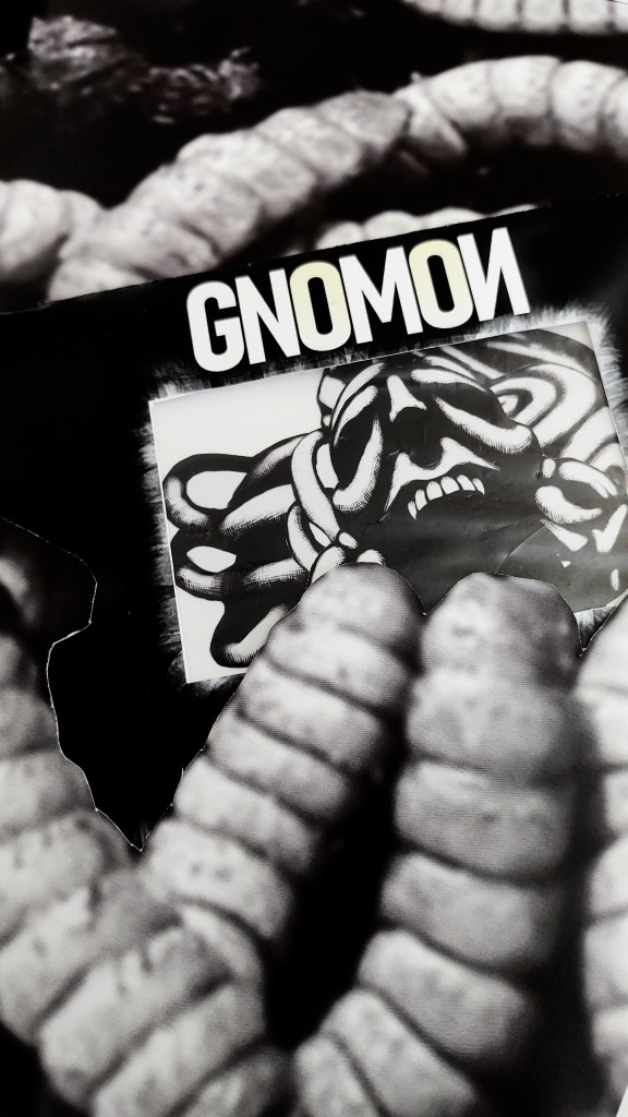
As bit of practice with promotional photography, I designed, printed, and assembled the sticker pack below as well.

I’d been working off and on to try to get a playable demo done, but the card mechanics I wanted to do were well beyond my ability to achieve. With only a few weeks left until the deadline, I decided there was no way I would be able to make something it even remotely presentable, so it was scrapped. Between it and the 3D models, several weeks of work were going to go unseen when I went to present the project, and what remained didn’t seem all that impressive. All side dishes, no main course, if you will. So as a last minute attempt to make something that would tie it all together, I made a short trailer. It was originally intended to be shown during our senior showcase, so the title sticks around longer than I’d have it under different circumstances, and the audio is likewise absent.
The main footage starts at 00:30, feel free to skip ahead.
